Regardless of how you print your photo book—through a Print-on-Demand (POD) service, short-run digital printing (SRDP), or an offset printing service—it can be a challenge to ensure that the images on the printed pages of your books are true to your photographic vision. When print quality is a priority, the choice of color workflow becomes critical. This is the final post in a series of three on managing color from computer to finished photo book. The first in the series, about using color profiles to soft proof on your monitor, is here, and the second, on creating the PDF to send to the printer, is here. This series follows up on posts on options for creating your photo book and printing your photo book.
When you are printing photographs in a darkroom or on an inkjet printer, you have the luxury of simply making test prints and tweaking the exposure, contrast, etc. through succeeding tests until you arrive at a print with the qualities you want. True, adopting color management practices like monitor calibration and using color profiles can streamline this process, but they are not strictly necessary. When you go to a photo book printing service, however, unless you have unlimited patience and an unlimited budget, it is not really practical to rely on repeated test prints to maximize the final print quality. Because of this, adopting good color management techniques is your best option for reducing frustration, saving you money, and improving your finished books. And it is not that hard!
Here are the main steps:
- Calibrate your monitor and use a color profile to previsualize—”soft proof”—how your images will print. This is covered here.
- Make sure that all PDF settings are correct when preparing the cover and interior PDFs to send to the printer. This is covered here.
- If you use an SRDP or offset printer, review printed proofs and make changes intelligently. This process is the subject of the this post.
Just to be clear, this series covers color image printing: printing black and white photos requires a slightly different treatment—perhaps a topic for a future post.
Proofs and the Proof Review Process for Your Photo Book
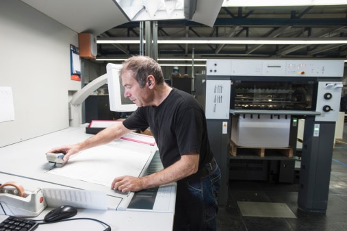
When you send your print files to the printer, they are run through the preflight department, which tries to catch all-too-common issues in the files, and then to a proofing department, which will use a specialized workstation, called a Raster Image Processor (“RIP”), to produce the final files that will actually be used to print your books. In the case of Print-on-Demand (POD) printers, the preflighting is automated and no proofs are supplied; the files are printed, and the books bound and shipped to you. Because no proofs are supplied, you have no further opportunity to check how the images in your book are going to print. You’ll see when you get the finished books (at which point, of course, it is too late to make any changes or corrections). Short-run digital printers (SRDP) and offset printers, on the other hand, provide proofs for you to check as a matter of routine, and in fact will require that you sign off on proofs before they print the books. There are several kinds of SRDP and offset proofs:
Electronic proofs
These are cheap—normally free—and can be emailed or otherwise viewed online. However, they still display the cover and pages to you in RGB color on a computer screen, not printed in CMYK on paper, which is how your final book will actually be produced. For this reason, electronic proofs are useless if you are really trying to maximize the quality of your printed images.
Digital Bluelines
These are monochrome laser prints of the cover and pages. They are highly accurate as far as the positioning of page elements and not much use at all for evaluating image quality. They are called bluelines because in the old analog workflow, when printing plates were imaged by making a contact exposure through negatives shot on giant process cameras, proofs were made by exposing special light-sensitive proofing paper through the negatives. Imaged areas of proofing paper, when developed, showed in blue, hence “blueline.” The DuPont tradename for this process is Dylux, which is also commonly used to refer to these kinds of proofs. Though the digitally printed proofs are called digital bluelines, they don’t in fact have a blue tint.
Contract Color Proofs for Offset Printing
Contract color proofs are printed on special proofing systems which are calibrated to match the look and color balance of the CMYK offset press on which the book will actually be printed. When you approve contract color proofs, you send them back to the printer, and they are placed in a special viewing booth right next to the offset press. The press operator compares printed sheets coming off the press with the contract proof you have approved and tweaks the press to make sure that your final pages match the proof you approved. This closes the loop, in terms of quality control. Contract proofs are typically excellent representatives of how your book will print, except that the proofs are usually not printed on the paper the book will run on, so that the subtle—or sometimes not-so-subtle—effect that the exact tint of the paper has on the reproduction of the images cannot be seen in the proof.
For books with hypercritical color and big budgets, a representative of the publisher may actually go to the printing plant wherever it might be—Italy, China, Canada, Wisconsin—and work at press side, checking printed sheets coming off the press and requesting color adjustments for the press operator to make. Because these plants typically run 24/7, these press checks turn into long days: I once spent three days and two nights at a printer in Canada doing press checks on a big book full of color images of Norwegian folk art. Because it costs a printer a lot of money to keep multi-million dollar presses waiting for you to tinker with press sheets, you will be charged for the extra press time. Plus you’ll have travel expenses, unless the printer happens to be in your back yard. Besides the cost, unless you really know what you are doing, the result might not be any better than it would have been if you’d just let the press operator work with your approved contract proofs.
If you are printing your book offset, you should request contract color proofs for your cover or dust jacket and interior pages. Contract color proofs of covers are standard. Contract color proofs of interior pages are usually quoted extra and they are not cheap. However, digital bluelines and electronic proofs are not adequate for critical color decisions, so contract color proofs are the way to go.
SRDP Digital Press Proofs
SRDP printers can produce printed proofs on the actual press and paper on which the final books will be printed. I don’t know whether all SRDP printers actually do this, but Bookmobile does. In addition, because cover lamination—especially matte lamination—affects color, we not only print cover and dust jacket proofs on the same press and the same paper that the final book will be printed on, we laminate them with the same type of lamination film that will be used on the final book. So in many respects, SRDP proofs are better than offset proofs, which are not printed on the actual press or paper stock.
If you are printing your book via an SRDP service, you should request proofs printed on the final print device and paper stock. Digital press proofs are much cheaper than offset press contract color proofs. While electronic proofs might be fine for many projects, they are inadequate for evaluating how images will actually print.
Reviewing Photo Book Proofs
After you send your order to the SRDP or offset printer, they will send back a packet with proofs of the cover and interior pages, along with approval paperwork. The routine is that you check the proofs, and you tell the printer one of the following things:
“OK to print”: The proofs are perfect in every way as far as you are concerned. Full speed ahead.
“OK to print with changes indicated”: There are a few things that need to be fixed, which you have marked on the proofs, but they are minor enough that you trust the printer to fix them and then go ahead and print.
In general unless the changes are really minor and you have worked with the printer before, it is safer to use the final option…
“Make changes and provide new proof before printing”: There are things that need to be fixed, which you have marked on the proofs, and you want to see new proofs after the changes have been made.
Note that everything—approval to print, changes, everything—is in writing. This, again, protects both you and the printer should something go awry. The stakes are too high, both monetarily and in terms of getting the best printed books you can, to be casual. And, if the printer is willing to accept verbal instructions, you are in a hazardous situation. Put everything in writing and keep copies.
The Importance of “OK to Print”
Just to be insistently redundant: “OK to Print” means OK to print as is with no changes. You have checked the proofs and every single thing is perfect as far as you are concerned. This protects both you and the printer. If the printer prints and binds the book and the final book is wrong in some way that did not show on the proof you approved, you are in a position to negotiate for a reprint or credit depending on the severity of the issue. Conversely, if you review the proofs and indicate “OK to print” and there is something wrong with the finished books that did show in the proofs, you are not going to get any reprinted books or credits because you didn’t flag it in the proofs for correction. This means you need to really, really check the proofs, not just glance at them and say “OK to print.”
I’ve written a whole post on checking proofs, so what I’m going to cover here is just image quality in the context of producing a high quality photo book.
Checking Color Images on a CMYK Proof
As I’ve discussed before ad nauseam, your RGB will not—can not—look the same when transformed into a CMYK printed page. If you have gone through the drill of calibrating your monitor and soft proofing and prepared your PDF correctly you shouldn’t have any major surprises when viewing your printed contract proofs or digital press proofs. However, this is where the rubber hits the road: this is where you are going to approve an offset contract proof or digital press proofs that the press operator will use as a guide for printing the actual book pages and cover.
Depending on your images, your CMYK proofs may look great right off the bat. Some kinds of images, however, are trickier. Images with pastel colors, for example, are notoriously tricky to convert and print in CMYK. Because they are made up of small amounts of color to begin with, slight shifts in the amounts of a single color—magenta or cyan in particular—can skew the pastel color dramatically. Pastels are going to require your attention on the proofs, and on the part of the press operator.
Choose a good place to review your proofs. Remember, it is the ambient light, filtered through the inks and reflected off the paper back through the ink, that determines the colors you actually see. The ambient light should be ample, and representative of where you expect your book to be viewed in terms of color temperature. Avoid nasty narrow spectrum fluorescents and dominant sunlight both.
Review each image individually. If it is OK, move on to the next one. To make changes or corrections you can either make them yourself in Photoshop and InDesign or have the printer do them. If you do them yourself and only a few pages are involved, you can output PDFs the affected pages individually to give to the printer: they are quite used to replacing individual pages. If a lot of pages are affected it might be more cost effective to output the whole book again. Ask the printer. In either case, it is super important to output any correction PDFs in exactly the same way you created the PDF the proof you just reviewed was made from: otherwise you will be starting over as far as reviewing proofs because the initial proof is no longer representative of what you have supplied.
If you want to have the printer make the changes, indicate any issues directly on the proof with a pen or marker. Indicate bad color shifts by saying “too red,” “too purple,” “too yellow,” etc. Only if you are an experienced CMYK prepress person or press operator would I recommend requesting specific changes like “-3% cyan in this area.” It’s like going to the doctor: you don’t go in and say, “Doc, I’ve got pneumonia,” you say, “My lungs are wheezing and I’m feeling rotten.” Let the experts do the diagnosis. If images look fuzzy, write it directly on the proof. If shadow detail seems to have disappeared, write it on the proof, circling the area you’re concerned about. So as not to waste time, though, make sure that the original image wasn’t fuzzy to begin with and that the shadow detail is actually there in the first place. The printer can’t create detail where there was none to begin with.
Returning the Proofs to the Printer
If you made the changes yourself and output new PDFs of individual pages or the whole book, send the PDFs to the printer along with the printed proofs with your marks on them. You should request another round of proofs unless the changes were few and those few were very minor. If you are having the printer make the changes rather than doing them yourself, package up the proofs with all your requests in writing on the proofs—and in a printed letter if you feel the need for more explanation. In either case, keep copies of all correspondence!
Rinse and Repeat
With every round of changes, view a new set of proofs. When there are no more changes to make, and all the proofs look the way you want them to—within the limitations of CMYK printing, remember!—tell the printer, in writing, “OK to print.”
Important Note: Don’t Just Check the Images on Your Proofs!
I have just covered reviewing CMYK image proofs here, and briefly at that. But you must check much more than just images: type, color tints, the paper stock specified, your shipping instructions. This is your last chance before 100, or 1,000 or 10,000 books are printed! For more info on the whole proof review and approval process see this post.
Inspecting the Books
As you may have gathered, printing books is a process that has a significant potential for error, both on your part and, I confess, on the part of the printer. You must inspect the books when you receive them so that if there are any issues they can be resolved quickly. It does no good to go back to the printer three months later: waiting will only complicate the process, and in some cases—like warped books or bad packing—it will be impossible to substantiate to the printer because they have no idea what has happened to the books since they left their plant. So open a carton and check for major stuff. Be aware that book printing is a manufacturing process and therefore there will be variability between books, which your ultimate readers will never notice because they are not comparing copies side by side. The questions to answer in this inspection are obvious things: were the books bound with the pages right side up and in order (yes, sounds stupid, but it happens); are there significant marks or dirt on the pages; is the color within a reasonable range of the proofs you approved; are there missing pages. Basic stuff.
If something is screwed up, take a deep breath. If its your fault, deal with it: accept the books as is or make the corrections and reprint, at your expense. If its the printer’s fault, document it: refer back to the correspondence you saved (remember you were going to save all the correspondence with the printer?). Sometimes, to be frank, when the correspondence is reviewed it turns out it was your fault after all: deal with it, as outlined above. If it is the printer’s fault, talk to the customer service or sales person about this issue: if it is not a matter of nitpicking about normal manufacturing variations on your part, they should do something about it.
This all may sound kind of negative, but it is part of the real world process of ensuring quality. Most of the time by far, if you put the effort into the process as I’ve described, you’re going to get great looking books.
Need a printing quote or more information?
I’d be happy to answer questions—you can contact me via email. You can request a printing quote here.
Don Leeper is founder and CEO of Bookmobile, which has provided design, printing, eBook and distribution services for book publishers since 1982. He set up his first darkroom in a basement bathroom in fifth grade and has worked as a professional photographer. He continues to satisfy his love of photography through appreciation of great images, an interest in photographic technology, and trying to improve his own photography.