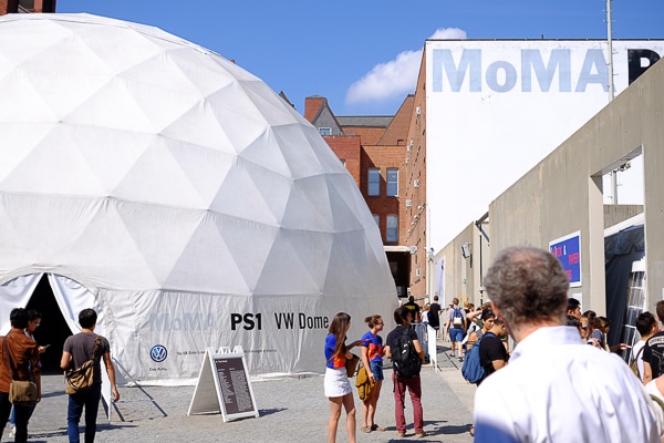
Long Island City, New York, September, 2015: the elevated trains, old industrial buildings, creeks, canals, and randomized street layout, along with the massive presence of the 1909 Queensborough Bridge gives Long Island City a kind of multi-layered industrial baroque feeling—think of a cross between R. Crumb and Richard Scarry. It was in the 80s but felt as if were in the 90s, as thousands of fairgoers crowded into MOMA PS1, an old—and very much un-airconditioned!—school building converted to a performance and exhibit space by the Museum of Modern Art. Nicole and I stalked the fair for a day and half, seeking out the beautiful, the interesting, and the ridiculous.
Here are some pictures I took of books I thought had interesting takes on the form, either as developments of the traditional aesthetic or as wild forays into materials science. Some of these examples are definitely in the realm of hand-made objects, while others could conceivably be produced in a normal book printing plant.

Jeff Khonsary of design studio the future, Vancouver and Los Angeles, holds
a book with foreedge, top and bottom colored bright green.

A pale pupil peers through a die-cut cover
with a white foil stamp. Published by Lisa
Pearson at siglio, Los Angeles.

Type printed in color on case, then debossed.
Clever! Published by Lisa Pearson, siglio.

These books can only be unzipped once! Published by Sternberg Press, Berlin.

Laser etched wood held by Andres Janacua, School of Visual Arts, New York.
Is this a book cover? Not sure, but it looks cool.


The interior of Danish artist Olafur Eliasson‘s house is laser cut slice by slice out
of the pages of this giant book. Studio Olafur Eliasson, Berlin.

Snowblind, limited edition by English artist Damien Hirst of the drug-
themed novel by Robert Sabbag. The cover is a mirror. The rolled-up
one-hundred dollar bill was printed specially by the Treasury
Department so that the serial number matches that of the credit card.
Published by Other Criteria, London and New York.

The rolled up bill hides in a cavity in the book.

Nicely done period design and foil stamping.
Published by Princeton Architectural Press, New York.

Another book-themed title: Unpacking My Library. Yale University Press,
New Haven and London.

White foil stamp, die cut opening, blind embossing, flush-cut boards,
and purple endsheets: 101 Things to Learn in Art School,
Published by The MIT Press, Cambridge.


Images of Architects: beautiful exposed sewn binding. The staggered marks
printed on the backs of the signatures help the bindery keep them in order.
The Name Books, Zurich.

Frans Masereel Centrum, a printing arts center in Belgium, printed out the covers of all their titles on an inkjet printer: this huge scroll is their catalog. The center has a studio with every kind of printing technology available for artists to use. Frans Masereel, the center’s namesake, was a Flemish painter and graphic artist who, among other things, made beautiful graphic novels in the early twentieth century.
Need a printing quote or more information?
I’d be happy to answer questions—you can contact me via email. I welcome any feedback, including that pointing out my errors! You can request a printing quote here.
Don Leeper is founder and CEO of Bookmobile, which has provided design, printing, eBook and distribution services for book publishers since 1982.


