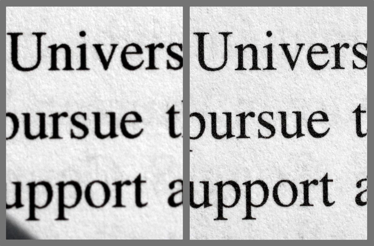
When we got our new Océ VarioPrint 6320 printers, we did not anticipate that their superior print quality could cause issues, but ironically that is what happened in one instance. The case in question was one where the designer used a typeface with very thin strokes. Our old Heidelberg printers, which tended to lay down the toner very heavily, thickened the typeface to a degree that looked pleasing on the page. The Océs imaged the font much more precisely, without the thickening, and the result looked light on the page.
This thickening of print images is not a new issue. On offset presses it is called gain. When halftone dots in printed images thicken, it is called dot gain, and it has to be compensated for when making the halftone image, or tonal reproduction will be poor. In offset printing, the gain is affected by press accuracy (or the lack thereof) and by ink spreading out into the fibers of the paper. Uncoated paper stocks are highly absorbent; therefore there is more ink seepage and more gain. Coated paper stocks have fillers that reduce the amount of ink uptake into the fibers and therefore the gain.
Different presses and different paper stocks thus result in differing amounts of gain. At one extreme, type printed on a newspaper web offset press on groundwood paper results in huge gain, as the ink seeps out into the coarse paper fibers: the letterforms appear grossly swollen and deformed when viewed under magnification. At the other extreme, the same type printed on a sheet-fed offset press on fine coated stock displays crisp letterforms under magnification. Some fonts in particular are prone to looking too light when printed without gain. Bodoni Book comes to mind, but even in common faces like Times Roman the ends of serifs can get mighty thin in smaller point sizes.
Digital presses produce gain as well, though the causes are different. Most digital presses use toner to produce the page image. Toner consists of tiny particles of plastic colored with black or other pigments. (Newer technology uses high-speed inkjet technology instead of toner, but that’s a topic for another post.) With digital presses, the paper stock also makes a difference: type printed on coated stock tends to be crisper. Other factors also affect gain. On most toner-based digital presses dust-like toner is transferred to an imaging surface–a drum or belt–by the attraction of static electricity. Needless to say, this is something of an imprecise process—a cloud of microscopic particles leaping through space to a surface! After being transferred to the imaging surface, the surface then transfers the image to the paper. The paper travels under a high-temperature filament that melts the plastic toner particles so they adhere to the paper. At each of these stages, miscalibration, the moisture content of the paper and the ambient air, and the vagaries of the fusing process can cause the edges of type to be poorly defined, either too light or too heavy. (Which is also why halftone dots are often poorly formed in toner-based printers, by the way.)
Our old Heidelbergs laid on the toner pretty precisely but also a bit heavily. Overall the density was pleasing, but it wasn’t necessarily 100% accurate to the type forms. Our new Océs lay down type images much more precisely. Press gain–as produced by our old Heidelbergs–can make the too-thin strokes of typefaces like Bodoni set in small point sizes look good, while the more precise imaging of the Océs reveals their visual weakness.
Going back a little further in time to metal type, type fonts created by the master foundries would have drastically different shapes at different sizes: a 10-point Bodoni when blown up to 36 points would look like it had grossly thickened serifs and thin strokes, as well as obvious cut-open areas (“ink traps”) in places such as the inside apex of a V. The thickening was to hold the thin strokes at the small point sizes. The ink traps helped prevent ink from filling in the inside joints of a letterform. This practice was carried over from metal type fonts to photographic film fonts of the early phototypesetting machines. In the film fonts, there were different film font masters for each type size—8-point, 10-point, 12-point, etc.—and the smaller point size fonts utilized ink traps and had beefed up thin strokes.
Printing technologies have changed from letterpress to offset to toner-based digital, but the issues of press gain, point size and typeface selection remain much the same. It pays to see printed proofs, especially if you are printing on a type of press you haven’t used before, or you are using a typeface of special delicacy. One big benefit of using digital printing is that you are able to see proofs produced on the same press the book will print on: genuine WYSIWYG! Proofs in offset printing are rarely produced on the press itself, but rather on digital printers or, in the old days, as photographic blue-lines: consequently, they do not accurately show how fine letterforms will print.
More about our Océ VarioPrint 6320s
The Océ VarioPrint 6320 prints at 600 x 1200 DPI at a 125-line screen. (Our previous printers printed at 600 x 600 DPI at a 106-line screen). It’s also a perfector—it prints both sides of the sheet in one pass. That means we can print your books fast and can fine-tune alignment so your pages back up accurately.
The Océ VarioPrint 6320 is a toner-based printer (all of Bookmobile’s printers are), but the Océ’s Copypress technology uses a lower temperature than other digital printers to fuse toner to the paper. Less heat means less paper curl and a crisper image.
Read my previous post on why I’m a big fan, Introducing Our New Printer!
Want to see a sample of our Océ’s printing? Contact Nicole Baxter.