Regardless of how you print your photo book—through a Print-on-Demand service (POD), short-run digital printer (SRDP), or offset printing service—it can be a challenge to ensure that the images on the printed pages of your books are true to your photographic vision. When print quality is a priority, the choice of color workflow becomes critical. This post is first in a series of three on managing color from computer to finished photo book, following up on posts on options for creating your photo book and printing your photo book.
When you are printing photographs in a darkroom or on an inkjet printer, you have the luxury of simply making test prints and tweaking the exposure, contrast, etc. through succeeding tests until you arrive at a print with the qualities you want. True, adopting color management practices like monitor calibration and using color profiles can streamline this process, but they are not strictly necessary. When you go to a photo book printing service, however, unless you have unlimited patience and an unlimited budget, it is not really practical to rely on repeated test prints to maximize the final print quality. Because of this, adopting good color management techniques is your best option for reducing frustration, saving you money, and improving your finished books. And it is not that hard!
Here are the main steps:
- Calibrate your monitor and use a color profile to previsualize—”soft proof”—how your images will print.
- Make sure that all PDF settings are correct when preparing the cover and interior PDFs to send to the printer.
- If you use an SRDP or offset printer, review printed proofs and make changes intelligently.
I’m going to cover step 1 in this post, and steps 2 and 3 in the next couple of weeks. Also, just to be clear, this series covers color image printing: printing black and white photos requires a little different treatment, perhaps a future topic.
First, a bit of background.
Background
The core issue with printing any image file is that displaying a color image on a computer screen is fundamentally different than printing the same image on paper. Computers represent color in the RGB (Red-Green-Blue) color scheme. In all but very rare instances, commercial presses print color using the CMYK (Cyan-Magenta-Yellow-Black) color scheme. This means that when you print an image on a commercial press, every point of color in an image that is represented on your computer by combining red, green, and blue in various intensities must be transformed into a combination of cyan, magenta, yellow, and black inks. Because the range of colors that can be created on a good RGB monitor—its color “gamut”—is larger than the CMYK printing ink gamut, there are colors that you can represent in RGB that are not reproducible by a combination of cyan, magenta, yellow, and black. Consequently the transformation is not as simple as converting each RGB color to the same color generated with CMYK. Instead, RGB colors that fall outside the CMYK gamut must be converted to different color within the CMYK gamut. How you make that transformation can make a big difference in how an image prints. The fact that the CMYK gamut is not as large as the RGB gamut doesn’t mean you can’t produce a photo book of the highest quality. It just means that you must work within the limitations of the CMYK medium, just as you work within the limitations of a particular kind of film or your particular camera sensor when you make a photograph to begin with.
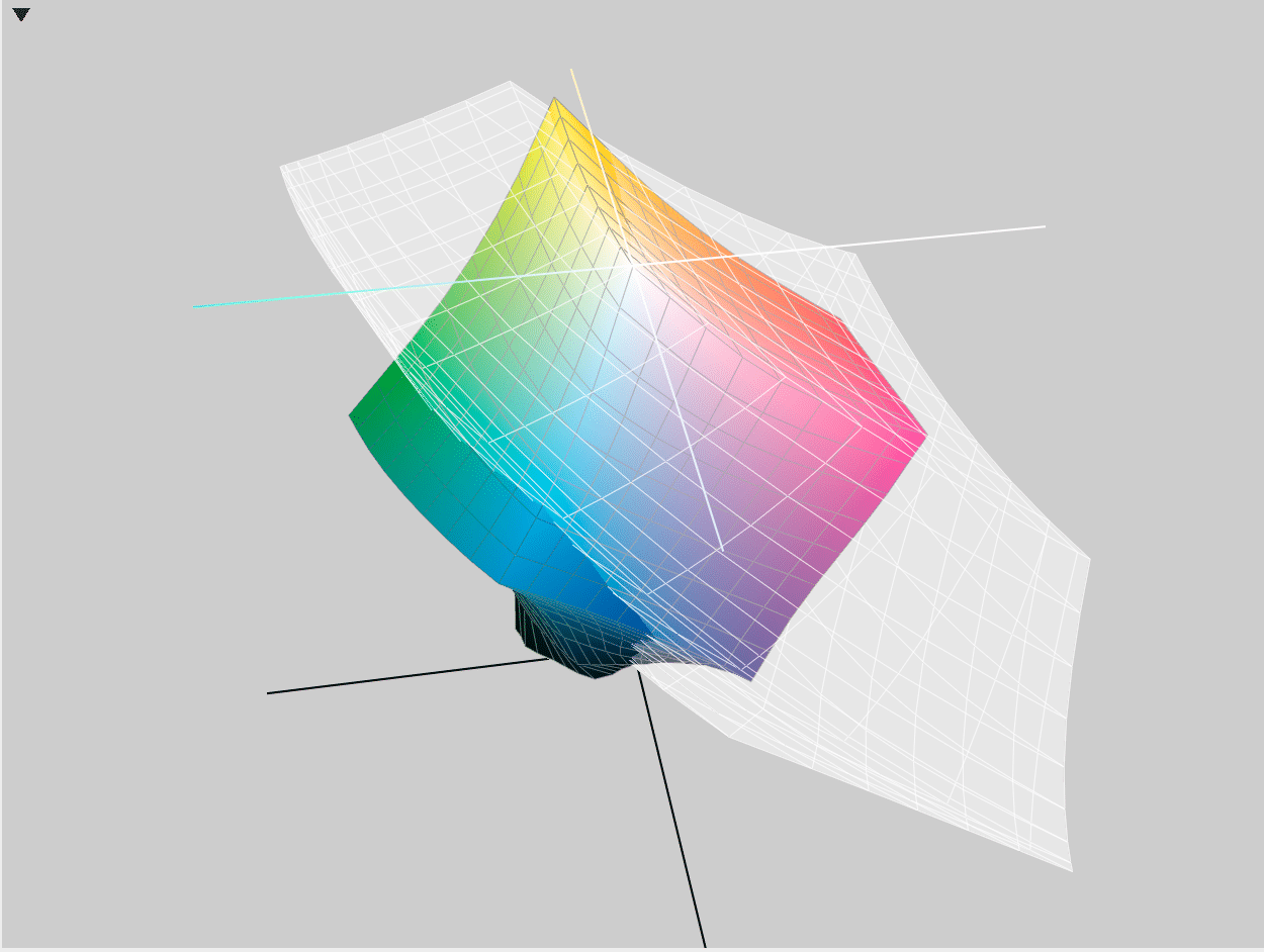
Graphical comparison of color gamuts between a Mac Retina LCD RGB display and the GRACoL2013 CMYK standard. Note that the colors shown here are themselves approximations: otherwise the colors that are shown as outside the LCD colorspace would show as black!
Besides the issue of differing RGB and CMYK gamuts, viewing an image on a computer screen and viewing it on a printed page differ in another important respect: one adds colors to arrive at the colors you perceive, the other subtracts color to arrive at the color you perceive. A color monitor emits the viewing light itself and makes colors by adding together different intensities of red, green and blue. An image on a printed page is viewed quite differently. Unlike a monitor, the page itself produces no light: the viewing light is whatever the ambient light is—a warm incandescent lamp, a fluorescent lamp, sunlight from a window, or, often, a combination of sources. The ambient light passes through the translucent ink on the page, reflects off the paper back through the ink, and enters your eye. The light that hits your eye consists of those parts of the spectrum that were not filtered out—subtracted—by the ink, not as in the case of an RGB, the colors that were added by the red, green and blue light-emitting phosphors on the screen. Which is why the RGB system is called additive and the CMYK system subtractive.
Besides the variability of the ambient lighting, the paper itself affects the colors ultimately perceived. What is called “white” paper actually varies from paper type to paper type, and even from mill lot to mill lot within the same brand and type of paper. Some “white” papers have a warm tint to them, others a cool bluish tint. In either case, the tint of the paper shifts the colors perceived as the ambient light reflects off of it.
The first step in the process of having your images print the way you want is to emulate the CMYK gamut on your computer screen by 1) calibrating your monitor and 2) using the CMYK color profile to “soft proof” the images, so you can get an idea of how they are going to print.
Before we look at this in detail, be aware that not all programs you might use to make book pages allow you to do CMYK soft proofing. Adobe Lightroom, for example, does not allow loading CMYK color profiles, so you can’t soft proof anything that’s going to be printing on a commercial press: that makes the Adobe Lightroom photo book tools pretty problematic! In my examples I’m going to use the industry standard software tools: Adobe Photoshop for image editing and Adobe InDesign for page layout, both of which allow soft proofing with CMYK profiles. But before that is step 1: calibrating your monitor.
Calibrating Your Monitor for Your Photo Book
Calibrating your monitor sets the intensity and RGB color representations to standard profiles so that when you soft proof with a color profile, the profile can accurately adjust the viewing colors. All monitors vary, even monitors of the same make and model, so calibration is essential. The best way to calibrate is to use a tool like the Datacolor Spyder5PRO or the x-rite ColorMunki. These tools are hung over the monitor so that the calibrator’s sensors are right up against the screen. The included calibration software generates colors on the screen, the sensor measures the colors, and then the software creates a profile that automatically adjusts the screen colors to standard settings. It will probably take about an hour the first time you calibrate. I have a Datacolor Spyder3, which works fine. x-rite has been making color calibration devices since long before the PC, so the ColorMunki probably works fine too. There are other brands as well: check reviews. Calibrators start at about $90, so they are not expensive. One further note about calibration: as with viewing printed pages, ambient light matters. See the calibrator instructions for the manufacturer’s recommendations for adjusting ambient lighting. Get the gadget and calibrate your monitor, and you’re done with step 1.
Soft Proofing
Now that you’ve calibrated your monitor, you can use a CMYK color profile to previsualize—aka soft proof—how your images are going to print. Many printing companies use GRACol2013, a standard sheetfed offset press CMYK profile. Because its often installed by default, I’m going to use it in my examples. If it is not installed on your computer you can find it here, along with a SWOP profile, which you don’t need unless your photo book will be printed on a web offset press, which is highly unlikely.
Your printer may have a custom profile for you to use to better match their particular press setup. If they do, they should also provide instructions on how to install the supplied profile on your computer. Bookmobile settings files and instructions can be found here.
Soft Proofing in Photoshop
First, set up your “Working CMYK” environment:
1. Go to Edit / Color Settings.
2. At the very top beside “Settings:” select “Custom.”
3. Set the options you see as follows:
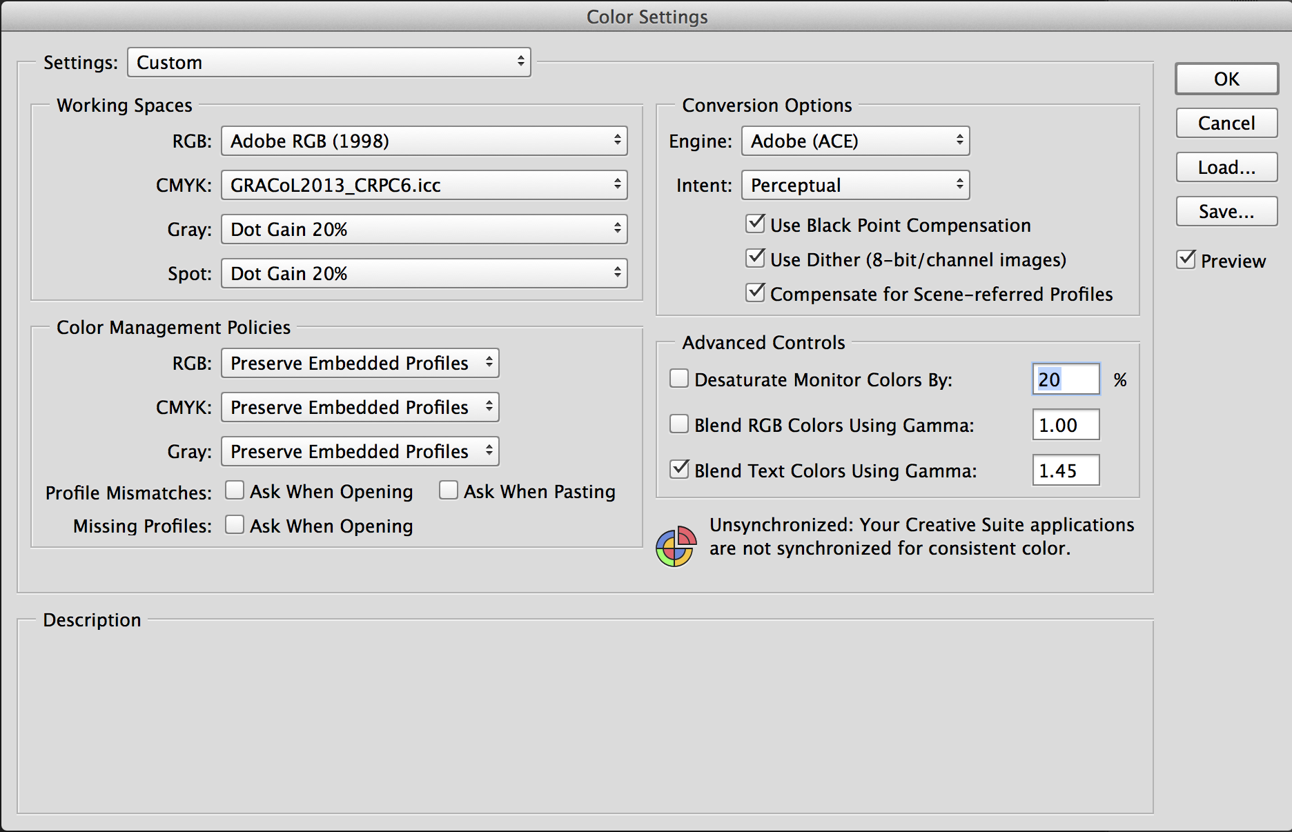
Color settings for soft proofing in Adobe Photoshop CC.
Now open an image and set up viewing for soft proofing:
1. Go to View / Proof Setup.
2. Select “Working CMYK.”
Now you can toggle between straight RGB viewing and Soft Proofing with the CMYK proof setup by selecting View / Proof Color, or on a Mac, Command-Y.
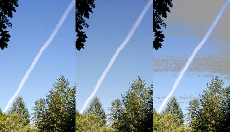
Gamut Warning
Another handy tool is the Gamut Warning, toggled with View / Gamut Warning. The Gamut Warning setting displays in gray those areas where the RGB colors are outside the CMYK gamut, as shown in the image below. Those are the areas you need to pay attention to when you’re adjusting the image for printing in CMYK.

Screen captures of Photoshop session:
Left-hand panel: Regular RGB view. (View / Proof Color toggled off.)
Middle panel: CMYK Soft Proof view, rendered with Perceptual intent. (View / Proof Color toggled on.) Note how the blues in the sky have been shifted to bring them within the CMYK gamut.
Right-hand panel: RGB view with gamut warning. (View / Gamut Warning toggled on.) The gray shading indicates areas of the RGB image that are outside of the CMYK gamut as defined in the GRACol2013 profile.
To use CMYK soft proofing in InDesign, you follow essentially the same steps I outlined above. Here’s additional info from Adobe.
Adjusting Color for CMYK for Your Photo Book
Because soft proofing gives you an idea of how your image will print on a CMYK press, you can use it to adjust the image on screen until it is optimized for CMYK reproduction. The color profile itself can do part of this, if you choose the right RGB-CMYK conversion method. There are basically two conversion methods—called conversion “Intents” in Adobe software—for converting RGB colors are that of potential use for photographers: relative colorimetric and perceptual.
How Relative Colorimetric Conversion Works
During conversion, specifying relative colorimetric intent does two things:
- RGB colors that fall within the CMYK gamut are mapped one-for-one to the corresponding CMYK color.
- RGB colors that are outside the CMYK gamut are mapped to the nearest color available in the CMYK color space.
How Perceptual Conversion Works
Instead of converting all the RGB colors outside the CMYK gamut to colors at the boundaries of the CMYK color space, the perceptual conversion method adjusts the entire range of RGB colors in a gradation—both those inside and those outside the CMYK gamut—so the all fit smoothly within the CMYK gamut.
Example
Let’s say a photograph has an area of blue sky in it. Like all real images, the sky has many gradations of blue because of changes between the zenith and the horizon, atmospheric factors like the edges of clouds, etc. It is likely that many of the blues in a piece of sky can be represented in RGB, but not all of them can be reproduced in CMYK.
• Using the relative colorimetric conversion method, all of the RGB blues outside the CMYK gamut will be mapped to the closest CMYK value at the boundary of the CMYK color space, and will map the colors which are already inside the CMYK gamut to their CMYK exact equivalent. This means all the detail represented in the RGB blue gradations that were originally outside the CMYK gamut are lost, resulting in areas of a flat, single color, unrealistic sky. This in turn will also likely create banding in the sky.
• Using the perceptual conversion method adjusts the entire range of colors in a gradation—both those originally inside the CMYK gamut and those originally outside the CMYK gamut—in order to preserve the gradation present in the RGB image. The result is that at any point in the blue sky of the image the CMYK colors will likely not match the RGB colors exactly, but the image is better than when converted with the relative colorimetric method because the gradation itself is not lost.
The upshot of all this is that when specifying the rendering intent for RGB to CMYK conversion—both for soft proofing and for creating PDFs for the printer—you should choose the perceptual option.
While using the perceptual conversion method does a lot of the heavy lifting in terms of rendering an RGB image into CMYK, for some images you may want to use the various tools within Photoshop—curves, levels, etc.—to optimize the image appearance when viewed with the CMYK color profile. Just as when you are adjusting a newly-converted RAW image fresh out of the camera, there is a lot of potential to improve the image here, as long as you think of CMYK printing as a medium in itself, and not as a way to match exactly colors seen on an RGB monitor.
When you’re done adjusting your images—and of course laying out the pages, and proofreading all the type!—its time to make the PDF to send to the printer with your order. That’s the topic for my next post.
Need a printing quote or more information?
I’d be happy to answer questions—you can contact me via email. You can request a printing quote here.
Don Leeper is founder and CEO of Bookmobile, which has provided design, printing, eBook and distribution services for book publishers since 1982. He set up his first darkroom in a basement bathroom in fifth grade and has worked as a professional photographer. He continues to satisfy his love of photography through appreciation of great images, an interest in photographic technology, and trying to improve his own photography.